Final presentation for Interaction Design Methods

The final presentation for Interaction Design Methods for Esensorics group can be found here: Interaction Design Methods – Final presentation – Esensorics

We have also updated the prototype that can be found here: Updated prototype

Screenshots from the new prototype:

1. Login page:

proto8.1

2. Survey selection page:

proto8.2

3. Survey grid page:

proto8.3

4. Survey grid page with axis naming and samples placed on the grid:

proto8.4

5. After submitting the survey you get back to survey list page with the done surveys disabled:

proto8.5

Developing the Next Phase of the User Interface Prototype

During the first phase we developed two prototypes, one in Axure and another in HTML. In this assignment we had to improve the initial prototype based on development plans and feedback.

We now focused only on the HTML version of the prototype and made many small, but significant changes. These changes include:

  • Design improvements, including colours, transparency of tagging window etc. Samples are now round, not square.
  • A change in the layout. More space is for the grid to place the samples and the grid should be visible in the browser fully. The samples are brought to left.
  • Samples will bounce back to the initial position in case the sample is not place on the grid.
  • The user has to choose the axis names before he can place the samples. If the user has not done it, samples will bounce back.
  • While tagging the samples, when user starts typing, the keywords are offered from the predefined list of keywords (dummy list). The user can decide to not use the predefined keywords and use his own.
  • Various error messages are displayed in case something is not done correctly before submitting the results.
  • The samples location is detected (x and y coordinates for each of the 4 samples). The coodinates are shown in the success message and those could later be saved in the database for analysis.

The latest version of April 19 prototype can be found here.

candytestver3

Developing the Initial User Interface Prototype

During the first phase of prototype development we decided to firstly do a simple prototype that would show the flow of basic functionality, and secondly, to develop a HTML prototype with the part of the functionality with the biggest focus.

We started by discussing about issues brought out in testing sessions, and ended up with a concept that we would like to have in a final solution, where all the issues from the testing sessions would be addressed.

Axure prototype

We created a prototype that would contain the main flow of the user from the start to the end, and would cover the main test cases.

The prototype can be found here:
http://w4v9ea.axshare.com/
password: asd2

The prototype is done in Axure and it contains the ability to go through the three main test scenarios:

  1. Log in.
  2. Find the candies survey.
  3. Place candy samples in the grid based on the axes.

The third task is done in a simplified way to introduce the main flow.

Login Survey selection

Grid

HTML prototype

We decided to focus in the HTML prototype in the most complicated scenario, that is scenario 3, where the user has to put the tasting samples to the grid. Our initial prototype has a basic design and contains three sub-scenarios:

  1. User can drag and drop items to the grid.
  2. User can set names to the axes.
  3. User can tag each sample with keywords. Currently can insert just one set of data, the later version will contain multiple tagging options.

The first version of the HTML prototype can be found here:
http://www.erkki.biz/esensorics-prototype/html/ver1/

HTML prototype version 1

Testing the paper prototypes

On Thursday we finished the initial versions of paper prototype which we improved on Friday. After that we started testing them with potential users.

For testing the prototype, we chose an iterative method, so instead of testing every participant with the same solution, we improved the solution each time after the test and only after that made the next interview.

In order to make the tests more realistic, we chose a very specific solution – putting tasting samples to the canvas. It was related to the product enhancement that Esensorics team anyway had planned to do next. We also chose a very specific product – we tested candies.  We used 9 different actual candies for the participants and labeled them from 1 to 9, and asked participants to taste them and give feedback.

The tests had the following structure:

  1. The tester was introduced to the general idea of the system.
  2. The tester was given specific tasks (3 main tasks and for one tasks up to 3 sub-tasks) to actually perform.
  3. While performing the tasks, one team member was acting as the computer and changing slides, adding, removing or moving elements across the paper canvas based on the activities the person did.
  4. When the participants were in trouble, they were asked to explain their thinking behind the action.
  5. After concluding all the tasks, participants were asked to explain what they did and what they thought they had to achieve. We asked several specific questions from each participant based on what we thought was important to ask to get more insight.
  6. At the final stage, we explained what we actually wanted to achieve and wanted to happen, and asked participants to give reflection what went differently compared to what we thought, and why. Also the participants were asked to give suggestions for improving the system. Participants were asked if the solution helped them to fulfil the goal.
  7. After each participants testing+interview, we spent some time to discuss inside the team what was wrong and what and how to improve, made the improvements and tested them with the next participant.

Around half of the solution was changed during the interviews and a large number of elements (incl. additional information, tooltips, help texts, buttons, titles) was added.

ISSUES BROUGHT OUT BY SUBJECTS

All in all the biggest source of confusion were the axes on the canvas, since the values for them needed to be set by the user, which seemed impossible without additional instructions.  Once the first sample touched an axis and the menu for inserting a name appeared,  the function of the axes became clear for the users.

Another feature that brought up many different questions was grouping the samples, since there seemed to be different understanding as to when and how grouping should be done.

ISSUES BROUGHT OUT BY EACH SUBJECT

Participant 1 

  • the axes are confusing
  • suggested some type of an in-app help

Participant 2 

  • the idea of the axes is clear, but naming it was confusing at the beginning

Participant 3

  • the axes are confusing and should be predefined
  • when grouping samples, one could be able to pick a name first and then tap on respective samples, and a menu for colour selection for the group would appear

Participant 4

  • the values of the axes should be predefined
  • maybe a tip for naming the axis could appear in the middle of the screen, with an “OK” button
  • “name the group” could be changed to “tag the group”
  • a line is not good for grouping

Participant 5

  • the error message should disappear when user does the right thing
  • the sample could “refuse” to stay on the canvas until the values for the axes are set

Participant 6

  • tried to tag two samples at the same time
  • “Go back” option for when one wants to change something before submitting something
  • expected the prototype to tell him how to name the axes
  • guessed that when using the application the second time, the same problems would not occur

Participant 7

  • asked if he can press group for making another group
  • selected samples after pressing “group”
  • asked if he could make a bigger group of two groups
  • maybe there should be a “back” button
  • suggested that the instructions could be in a tutorial mode

Participant 8

  • asked whether the axes are based on the liking of the taste
  • didn’t press on “Group” before selecting the samples
  • didn’t press “Next”
  • wanted to take a sample out of a group and retag it
  • there should be options for grouping/ungrouping


WHAT WE LEARNED

The step by step instructions and showing user where he is in the process (progress in steps) and “next” button were added and it worked well.

Error messages should appear when a button clicked and some requirements are not filled, but they should go away right after the error reason is extinct, even without clicking the button again.

The axis naming window will show up when the first sample  is moved and system should not let them drag and drop before naming the axis to avoid confusion (so samples go back to original place).

There are several options of grouping and none of them is the best (each of them has disadvantages). Some users prefer to use grouping with fingers by moving the items; some wanted to drag the items and drop them to “Group” icon, and some wanted to select the items and name them as groups as they wanted. Circle on the grouping icon was misleading. Group name should be set before starting to group things. It is good if different groups have different colours, although the colours should not  be set until they are grouped and named already (to avoid confusing the colour name to the product’s attributes).

Samples after moving to the desired position get a “+” sign automatically so that people would understand that more info can be added to the samples.

Once tags are written, samples will show a number of assigned tags in a colourful circle. One tag name will stay visible next to the sample.

Tooltip will appear while going to any place and will indicate the next step (sometimes with text fields or buttons).

Fixed axis is also an option to consider. Did not find an ideal solution.

We can surely conclude that the solution interviews together with the actual solution prototype was a really good idea, otherwise theoretical talk would have given 10% of the value compared to what we received now.

Market Calculations for Esensorics

Main target of this tool is Estonia and Finland markets, however since the solution itself is not limited to these countries it can be easily scaled to any market. The challenge here is to get the attention of the foreign market.
An overview of TAM, SAM and SOM is shown in the image 1. From TAM to SAM, you can see a 20k reduction of target companies. This is because the type of food they produce does not match this tool’s functions. For example pasta companies won’t be testing their product the same way as ready to consume product companies, such as candy or cookie, do.
In the next level from SAM to SOM, the marketing of this tool is directed towards larger companies for several reasons: -They conduct more product tests and in larger scales, -They have the budget to pay for the tool -They care about collecting data and logs of the past testings.

tam-sam

Image 1: An overview of TAM, SAM and SOM

However since Esensorics is a SaaS, the size of the market in this case does not only relate to the number of companies in SOM. But frequency and size of their testings are also important. For example having 10 company with daily testings, can be better than having 100 companies testing once in a month. An important factor that affect number of testings, is introduction of new food products in the market. New products generally need more testings and in some cases companies conduct user testing only in case of a new product.

Look at the image 2 for details of testing frequency(left) and number of new products per year(right).

Image 2 : Frequency of quality control(left) and new product per year(right) in Estonian food market

Image 2 : Frequency of quality control(left) and new product per year(right) in Estonian food market

*Main source of this post is market research done by marketing part of Esensorics team

**These numbers are estimations not factual numbers, they are driven mostly from around 30 company interviews.

Assignment 3 – business canvas update, analogs, antilogs, solution interviews

We had a thorough meeting with Esensorics business project owner and the team, after which we made improvements to the canvas. In the meantime we have also focused on developing further the most important part of the system.

We decided to focus on the survey participant (taster) side and even more specifically, in the following weeks to focus more on the part where user can play with placing different products in multiple self-created axis.

Business canvas

After validating the business canvas with Esensorics business team, we have made many changes and improvements to the canvas. The new and updated version 4 is available here: http://leanstack.com/canvases/200027.

Analogs and antilogs

During meetings we raised a question what is the current uniqueness of Esensorics system. We found it difficult to differentiate it from survey management tools. For survey management, anyone could use famous tools like Surveymonkey.com or Google Forms for more simplistic ones. The business owner found it also difficult to explain why any food company should use their survey system instead of Surveymonkey or other similar tool, for technical solution. We proposed that they should work more on the food industry specific functionality, like pre-defined and recommended parameters and scales for food tasting, or good quality assurance or management dashboards for constant monitoring of production quality. Such functionalities would definitely create a food industry specific competitive advantage.

In the analogs and antilogs part we are still focusing on the sensory analysis tools.

Analogs

Lapka

To test the “nitrate concentration” takes food testing into an innovative turn that empowers the customer to give an informed decision about organic food, considering all the law sues that have appeared overtime against food companies that claimed that their products were 100% natural.

Ratebeer
From the large amounts of information to the personalized ratings and social interaction, ratebeer has proven to be a potentially successful project that may not focus on professional food testing, but it provides for sure a source of opinions and experience that are helpful to guide newcomers and food enthusiasts in their search for different flavors and emotions.

SIMS Sensory Software

SIMS software provides the solutions to meet research needs. By continually and consistently making improvements to its product line, and using the newest available hardware and software technologies, Sensory Computer Systems maintains its leading-edge position in the automation of Sensory and Marketing Research.

Creators mostly focused on to create flexible, easy to use, bug free and affordable product. Based on the client comments on their website we learn that value for the price paied and the willingness of SIMS personnel to customise to the needs to clients are two most important things, clients are looking for while taking for the too. Even though SIMS Sensory solution can’t brag with the huge amount of subscribers it still managed to maintain reputation by delivering quality service.

Compusense

Originally established in Canada Compusense is another tool for the sensory analyses, clients of which are one of the biggest companies of the world including: Pepsi, CocaCola, McDonalds… Again the tool focuses on user friendliness and exceptional customer support service what proves that those two aspects are one of the most important issues for the customers. Compusense has been created in order to meet the business needs however their website allows everyone to download and test the free trial version of the tool in order to have an insight about the way it works. It can be listed as an analog of our solution as long as it has been operating successfully through 20 years of industry experience.

Antilogs

Tricorder device by Aydogan Ozcan

What started out as a food testing technology in the University of California evolved into a more advance medicinal instrument that has been referred as exported from “Star Trek” because of its futuristic approach to consumer interaction. As much as the development of this technology is growing strong with every year (and it’s use might become more important than food testing) it never developed into a simple application that could have enhanced the evaluation of nutritional values to the common citizen.

AgraApp
Agra specializes in nuts. Their cause (preventing food allergies) is very noble, and even more admirable when the application is free, but food testing is not made possible through this instrument, when it could have been. An opportunity has been missed, perhaps, to focus more on allergy precautions.

FIZZ by Biosystemes

Founded in 1985, Biosystemes has been developing and marketing sensory analyses and consumer test software since 1988. FIZZ fits all activities from more routinely analyses for quality control, to the more specific needs of the research centers and the universities in the various domains including the food industry as well. Creators say that they took for it because during eighties there were no tools allowing managing sensory analyses. This software solution still maintains success even after years however their focus is more on bio research, rather than on food companies. Biggest customers of the FIZZ are research centers and universities. Later on, some time after foundation, they also switched their focus towards bigger industry and expanded an operating scale on different types of products, like cars, personal care products and cosmetics.

Conclusions

It is important to identify opportunities that may come along in the design process of the interactive application in order to develop a complete and sound experience for the prospective users. More than food testing, what are the side alternatives that might evolve from it? Questions like this are to be paid attention to. Quality is another relevant element to pay attention to, since health issues are playing a very important role in the user’s life.

References

Solution interviews

When we started creating user stories, by creating only 50 stories that are quite general, we understood that we need to focus on some specific functionality both from testing and development purposes. 

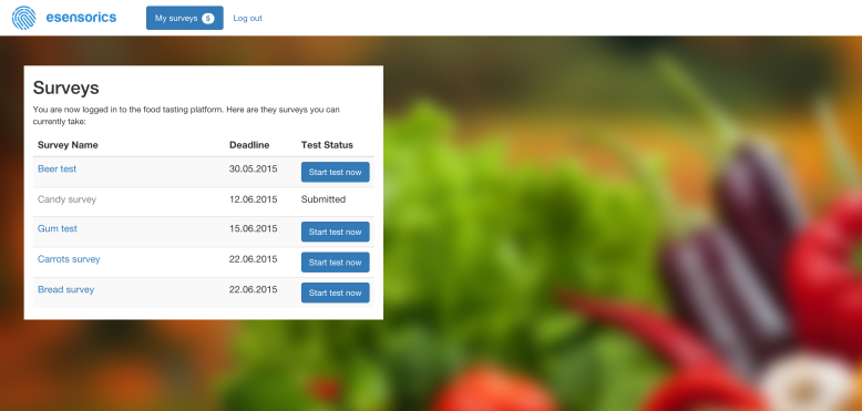
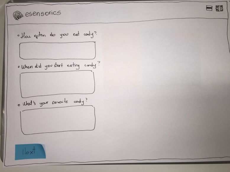
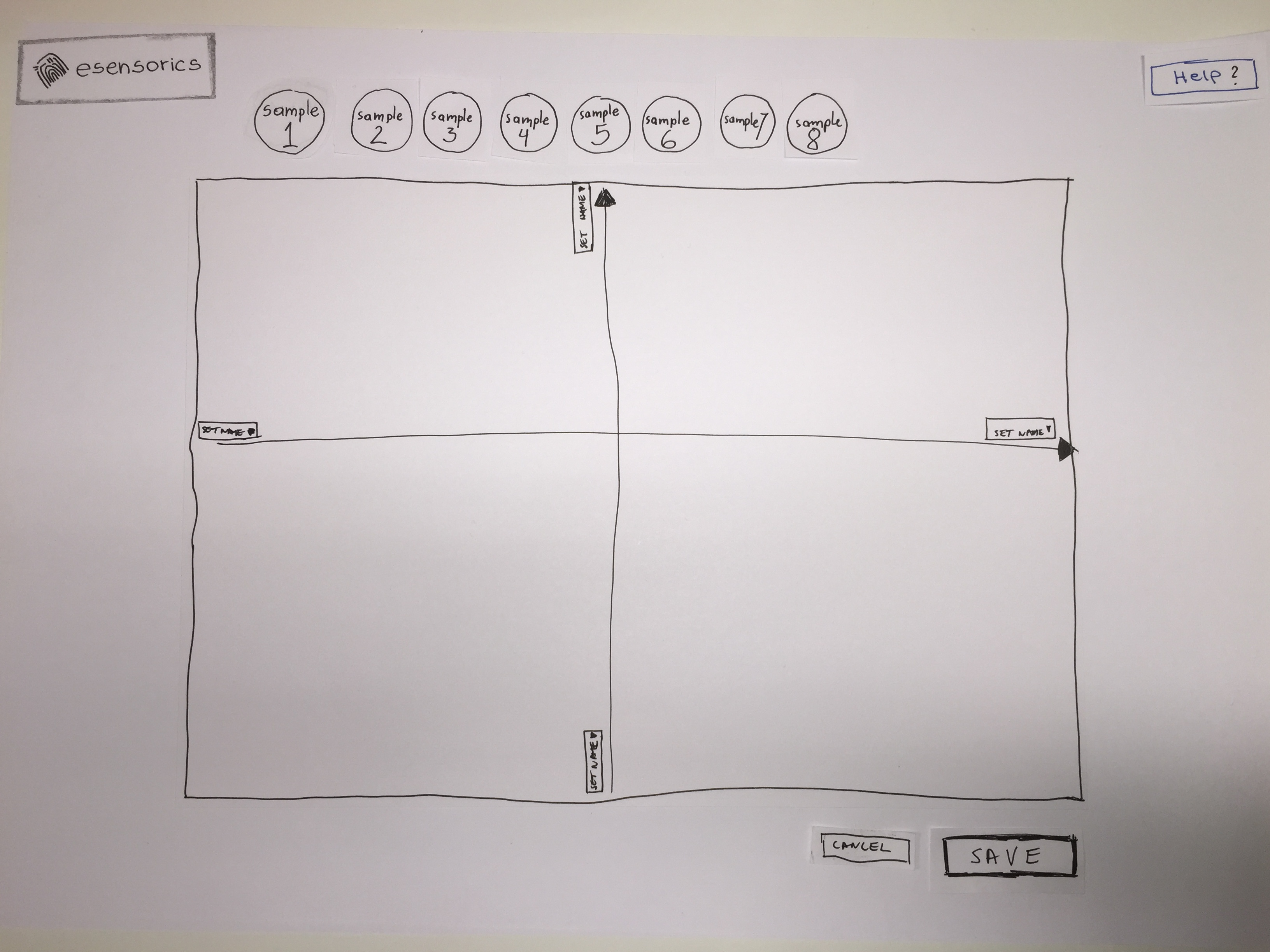
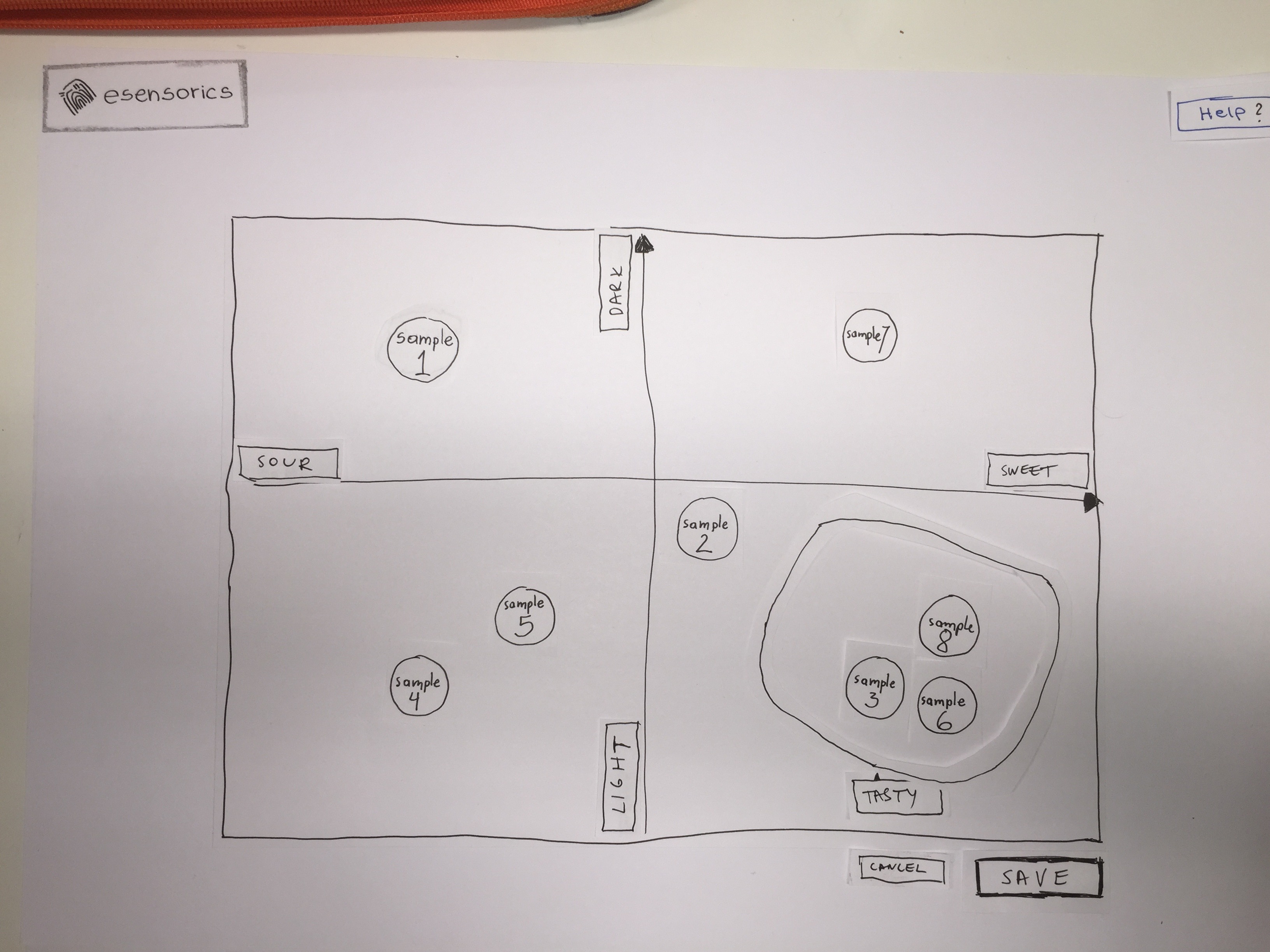
Together with Esensorics team, as mentioned before, we decided to focus on the survey participant (taster) part. We discussed about different solutions that are currently in use. The most used solutions are different form elements such as 1-5 or 1-7 selectable scales, input fields, text areas, radio-buttons and checkboxes. We found out that Esensorics is currently redeveloping a solution for visually putting tasting samples into a graph that is combined from 2 axis. The taster can name the axis as free text. Afterwards the participant can set tags to the samples and also group them by drawing a line, and then name the group. The solution has many disadvantages, out of which the biggest one seemed to be the level of difficulty and amount of time needed for the analysis of the results, as everything is in free text form. The aggregation of data is mostly manual.

During Interaction Design Methods course we had an assignment to create a paper prototype of some functionality of the system and also to create test cases. We decided to use this as the basis for our solution interviews. Instead of just testing paper prototypes, we combined the paper prototype testing with talk-aloud session and after doing the testing the subjects had to answer questions, give suggestions etc.

We chose an iterative method, so instead of testing and interviewing every participant with the same solution, we improved the solution each time after the interview and only after that made the next interview. Therefore, it cannot be called a minimum viable product finding method, rather the best solution finding method for one specific, but important part of the functionality.

In order to make the interviews more realistic, we chose very specific solution – putting tasting samples to the grid and axis; and a very specific product – tasting candies.  We used 9 different candies for the participants and labeled them from 1 to 9.

The interviews were with the following structure:

  1. The interviewee was introduced the general idea of the system.
  2. The interviewee was given specific tasks (3 main tasks and for one tasks up to 3 sub-tasks) to actually do. The basis was the paper prototype.
  3. While performing the tasks, one team member was acting as the computer and changing slides, adding, removing or moving elements across the paper canvas based on the activities the person did.
  4. When the participant was in trouble, they were asked to explain their thinking behind the action.
  5. After concluding all the tasks, participants were asked to explain what they did and what they thought they had to achieve. We asked several specific questions from each participant based on what we thought was important to ask to get more insights.
  6. At the final stage, we explained what we actually wanted to achieve and wanted to happen, and asked participants to give reflection what went differently compared to what we thought, and why. Also the participants were asked to give suggestions for improving the system. Participants were asked if the solution helped them to fulfil the goal.
  7. After each participants testing+interview, we spent some time to discuss inside the team what was wrong and what and how to improve, made the improvements and tested them with the next participant.

Around half of the solution was changed during the interviews and a large number of elements (incl. additional information, tooltips, help texts, buttons, titles) was added.

Some examples of what we learned and improved in the system during the interviews:

  • The step by step instructions and showing user where he is in the process (progress in steps) and “next” button were added and it worked well.
  • Error messages should appear when a button clicked and some requirements are not filled, but they should go away right after the error reason is extinct, even without clicking the button again.
  • The axis naming window will show up when the first sample  is moved and system should not let them drag and drop before naming the axis to avoid confusion (so samples go back to original place).
  • There are several options of grouping and none of them is the best (each of them has disadvantages). Some users prefer to use grouping with fingers by moving the items; some wanted to drag the items and drop them to “Group” icon, and some wanted to select the items and name them as groups as they wanted. Circle on the grouping icon was misleading. Group name should be set before starting to group things. It is good if different groups have different colours, although the colours should not  be set until they are grouped and named already (to avoid confusing the colour name to the product’s attributes).
  • Samples after moving to the desired position get a “+” sign automatically so that people would understand that more info can be added to the samples.
  • Once tags are written, samples will show a number of assigned tags in a colourful circle. One tag name will stay visible next to the sample.
  • Tooltip will appear while going to any place and will indicate the next step (sometimes with text fields or buttons).
  • Fixed axis is also an option to consider. Did not find an ideal solution.

We can surely conclude that the solution interviews together with the actual solution prototype was a really good idea, otherwise theoretical talk would have given 10% of the value compared to what we received now. We can also conclude that it is worth developing into the product, but at the same time considering different alternatives for parts of the solution, and that can be done, for example, but letting the survey creator choose between different options.

Startup events

We decided together with Esensorics business owner that it would not be wise for us to try to sell the idea to stakeholders or potential mentors if we are not the project authors. Therefore we did not participate in any such event with the purpose of pitching the idea.

Nevertheless, two or our team members participated in the EstCHI events in Garage48 and some plan to take part in the future events such as OpenCoffee and others.

Additionally, we have tried to pitch the idea on some of our friends/acquaintances and also during the interviews to the test subjects. The topic seems interesting, but new to everyone, as nobody has ever been as a participant in such tasting sessions.

Testing tasks

Task 1. Log in and find the survey called “Candy tasting”.

Task 2. Fill in the candies specific questionnaire and move to the next page.

Task 3. You are tasting 8 candy samples. Please express your feedback and make sense of your experience using this screen.

Subtasks if users does not use all the possibilities:

Task 3.1. Place the samples in the area accordingly.

Task 3.2. Name the axis based on the way you moved the samples.

Task 3.3. Based on similar items, create your own groups and name them.

User Stories, Interaction Design Methods, Group Assignment 3.1

While writing user stories we came across 4 main roles in the system: Taster, Survey creator, Analyst and Administrator. These roles don’t have one to one correspondence with personas, they are one level deeper than personas in details and functions.
We also tagged user stories based on their types(categories), their priority for implementation (1:high priority, 2:low priority) and their difficulty of implementation (1:easy, 2:difficult).
Please see the stories HERE.

A short summary of users stories:

User role Number of related stories
Any user 4
Taster 17
Analyst 6
Survey creator 12
Administrator 11